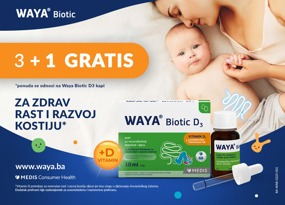
Waya Biotic is a probiotics brand on the European market known for its high-quality formulations tailored for different age groups (baby, kids and adults).
To strengthen its brand presence, I was tasked with a redesign of the brand key visual that would help effectively communicate its benefits and appeal to specific target audiences.
To strengthen its brand presence, I was tasked with a redesign of the brand key visual that would help effectively communicate its benefits and appeal to specific target audiences.
These visuals were further translated into many European languages and turned into leaflets, flyers, brochures, stickers, wobblers, social media content and other digital and printed promotional materials.
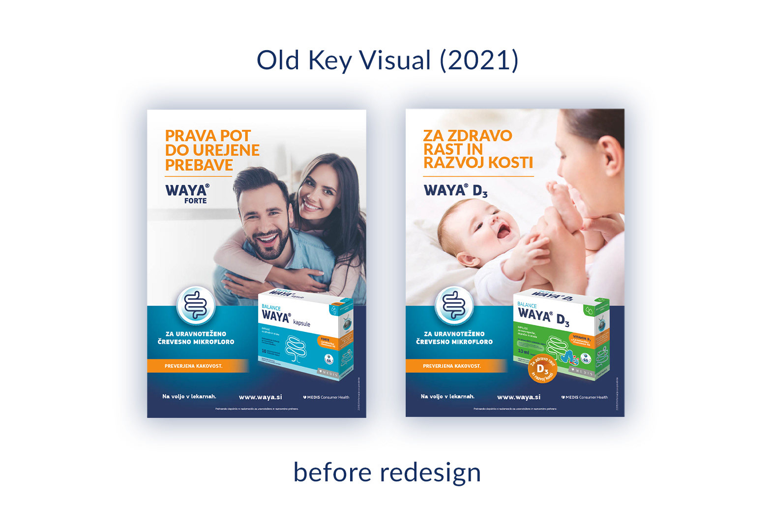
For reference, this is the old KV, that was in use since 2021. The original key visual lacked a clear connection to the product. It featured happy, generic lifestyle imagery and therefore didn't immediately communicate that this was a probiotics brand. The redesign focused on making the product’s purpose and benefits instantly recognizable.
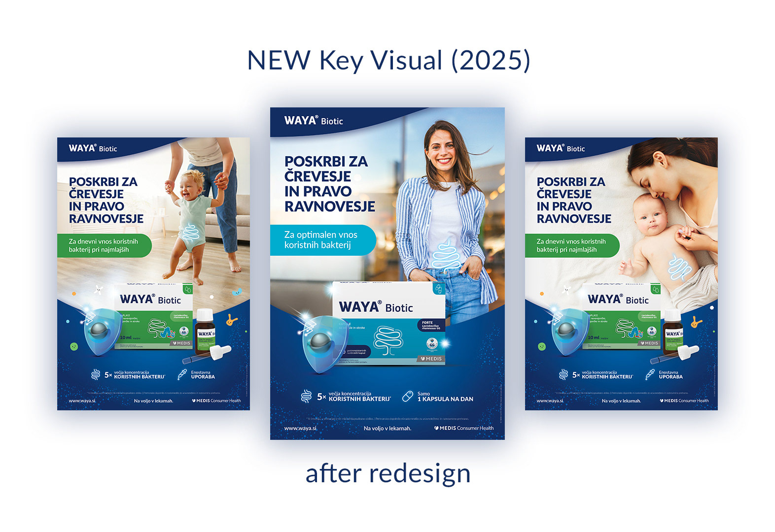
The project included three distinct key visuals:
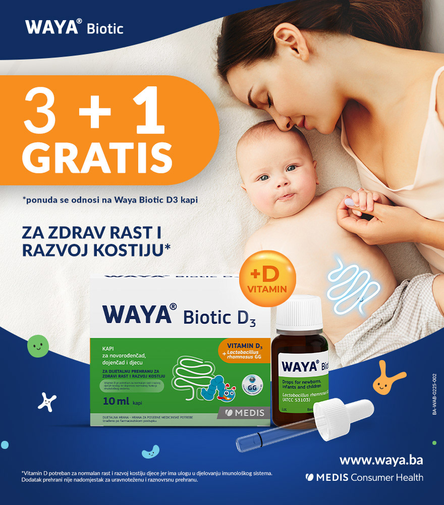
- Kids' image key visual
- Adults' image key visual, and a
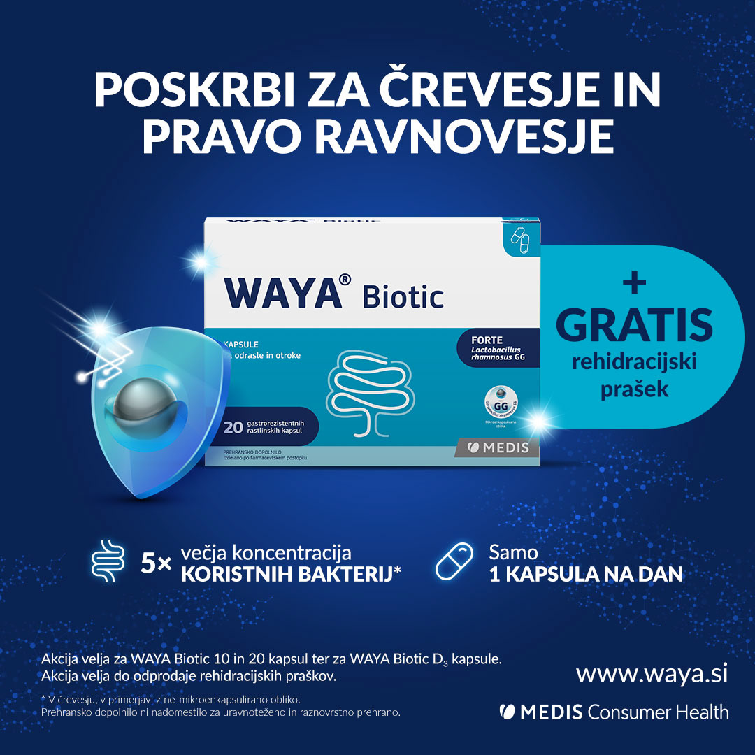
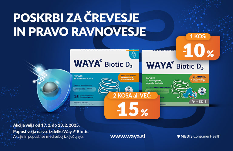
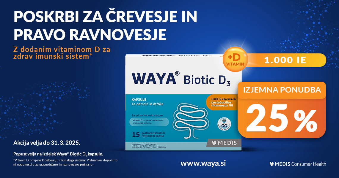
- Product key visual, that is focused on highlighting the product itself and its benefits.

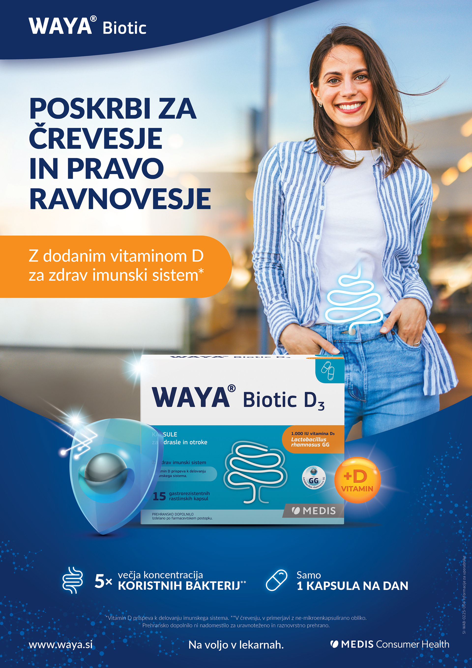
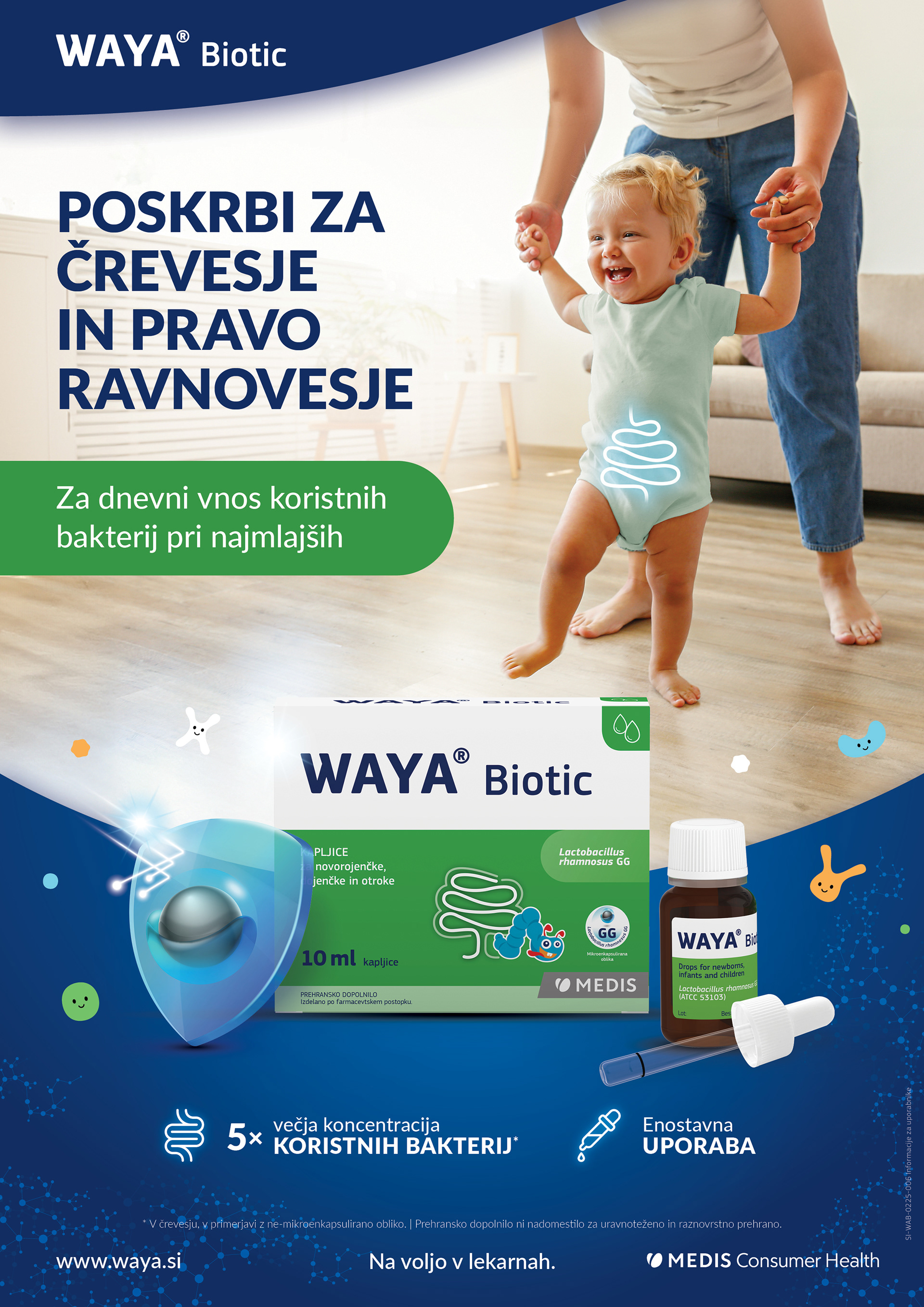
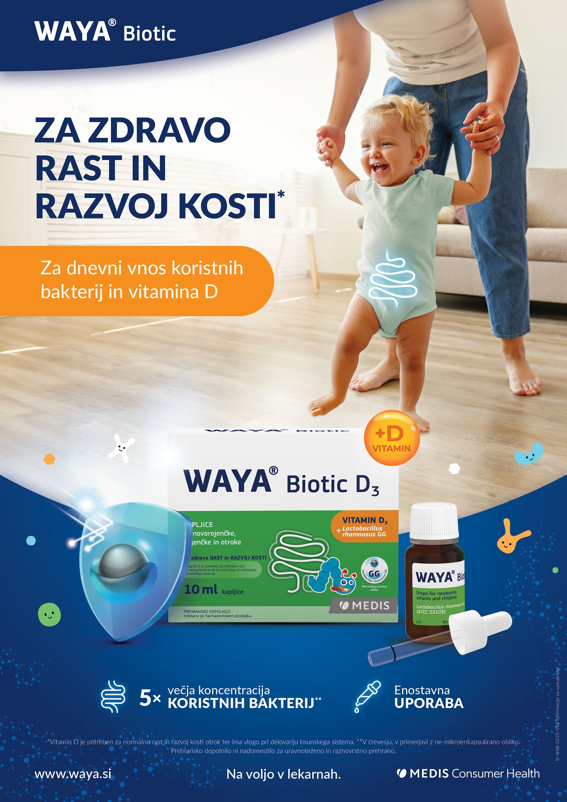
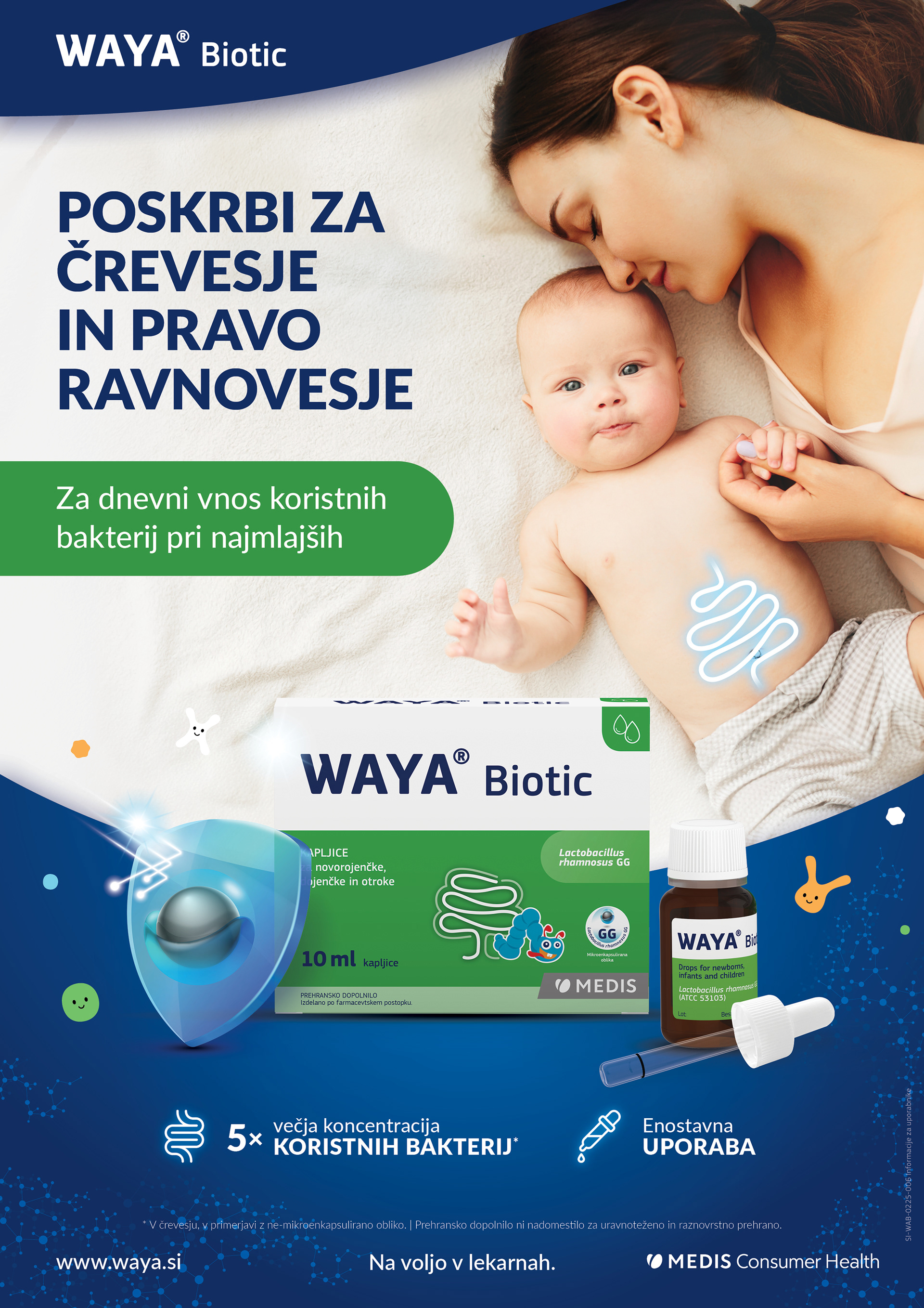
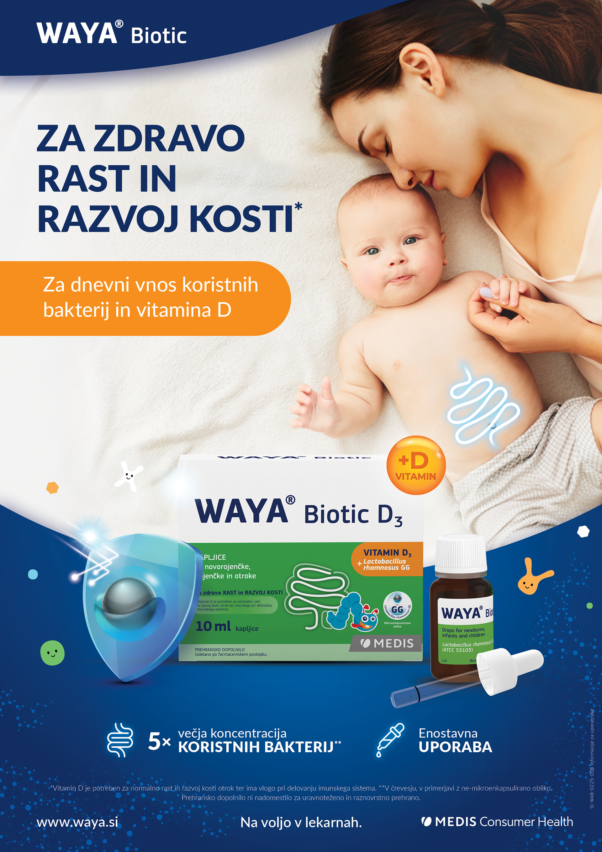
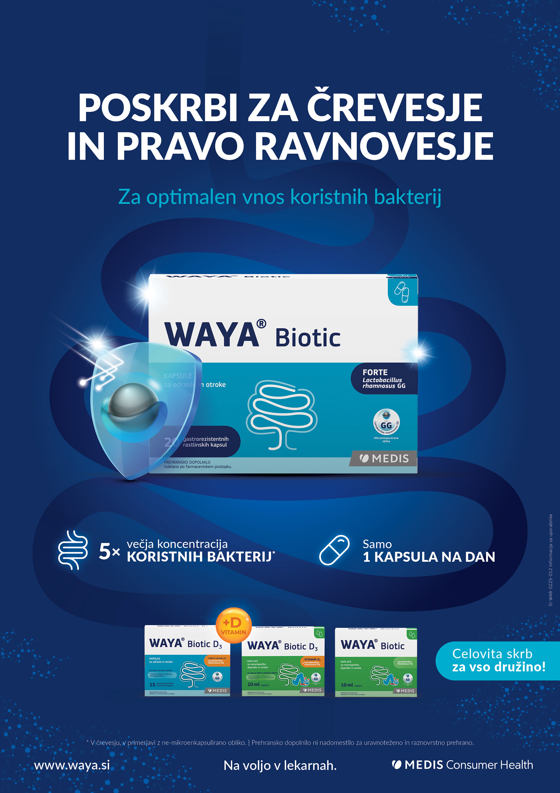
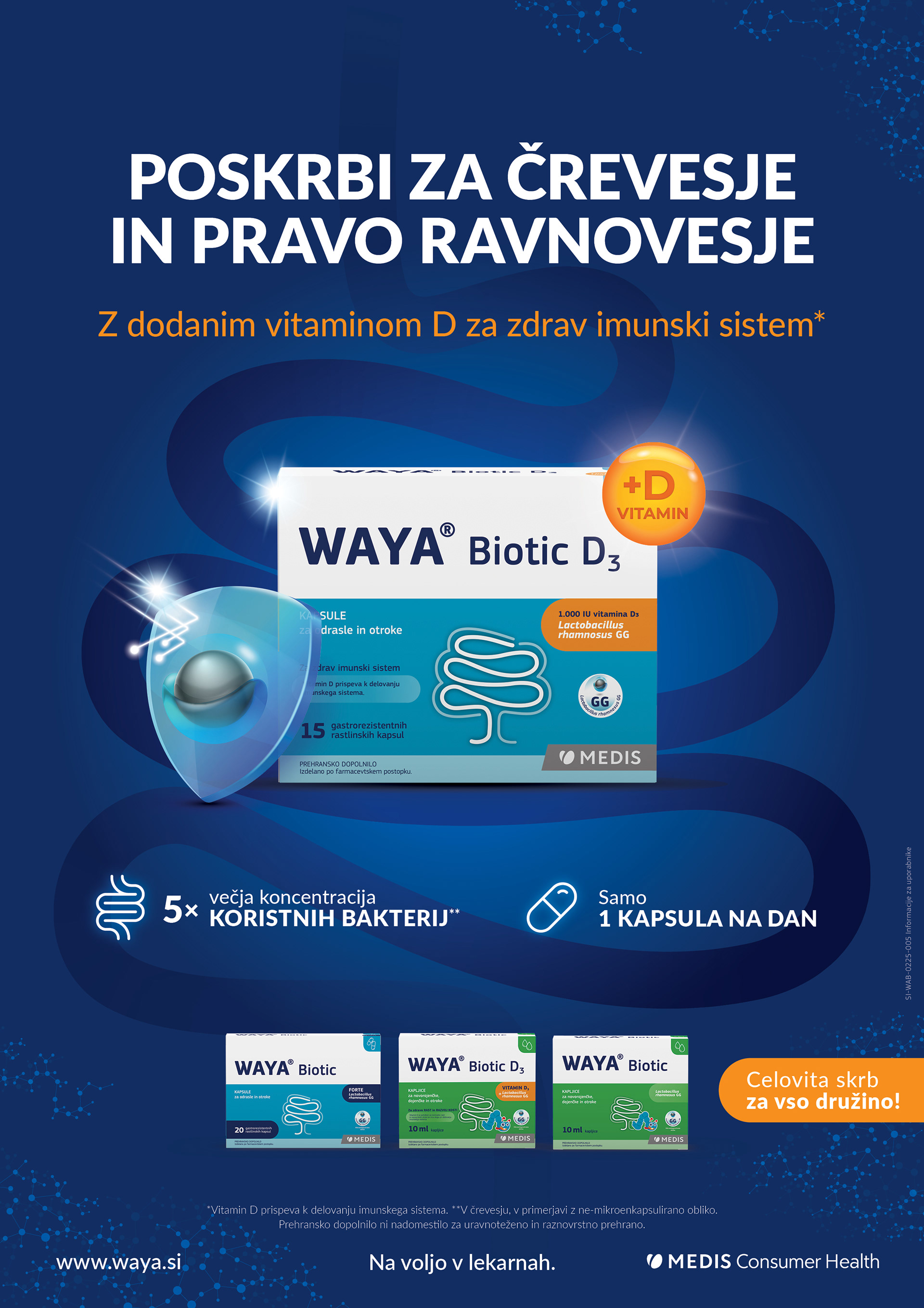
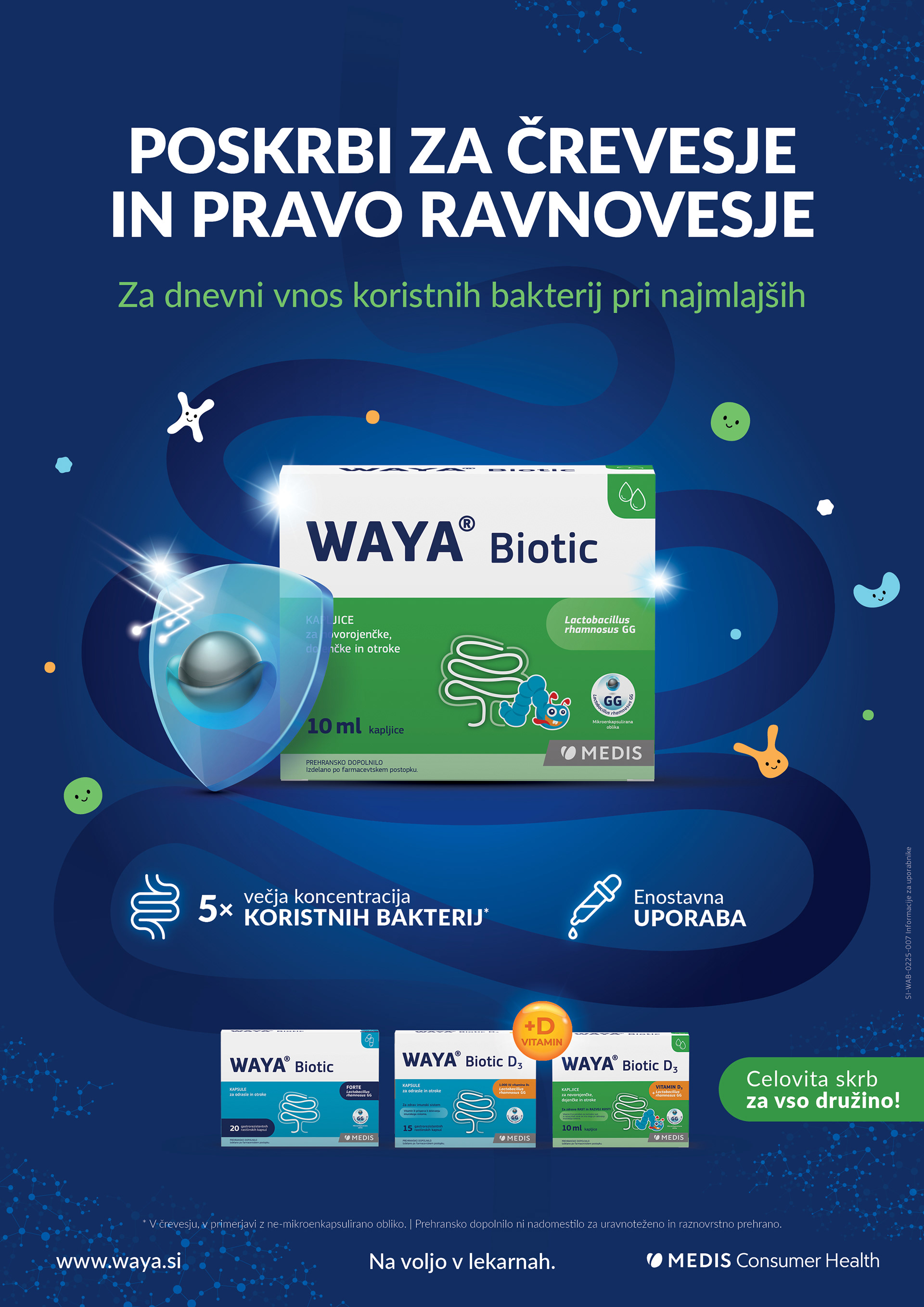
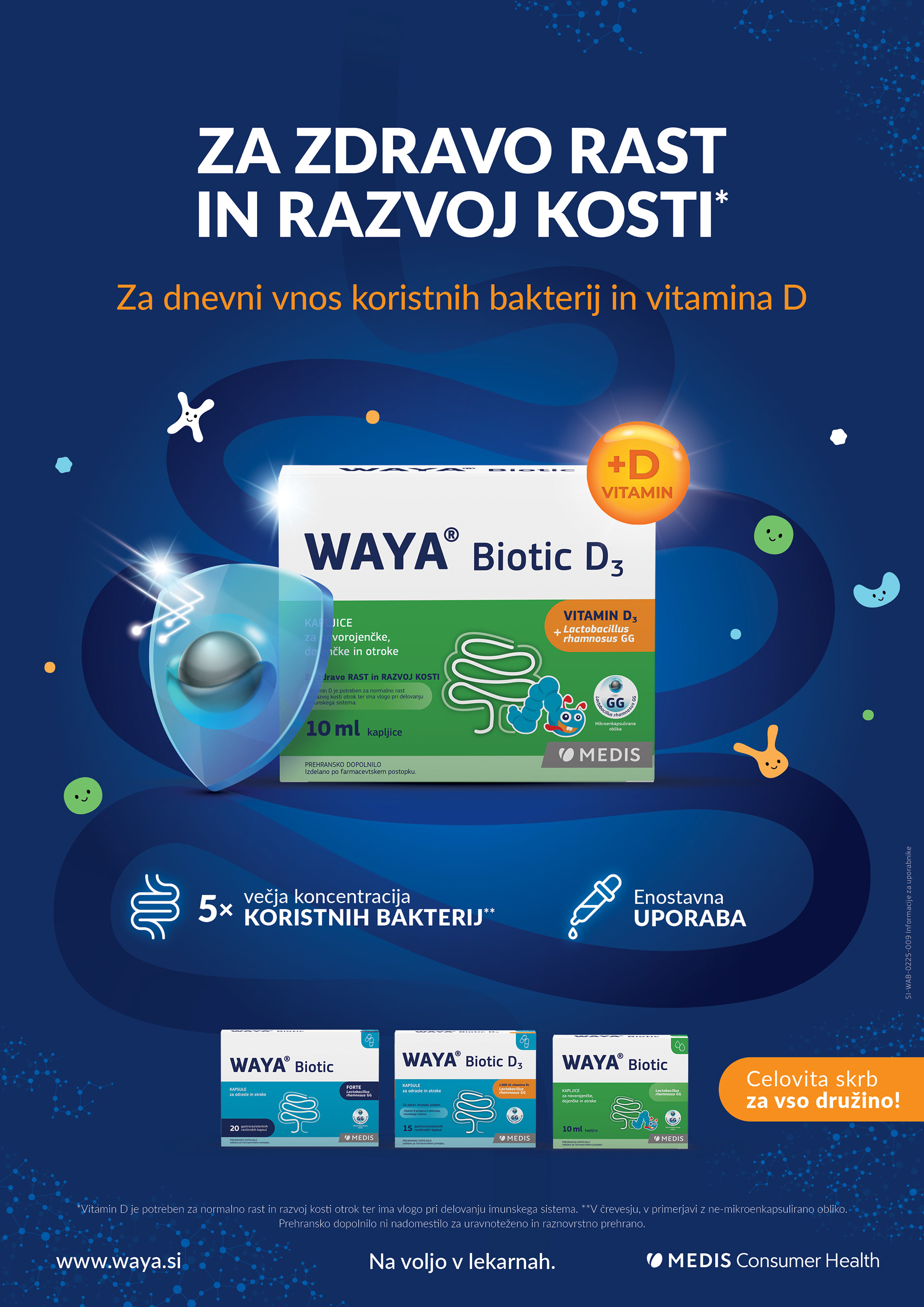
Examples of sales banners and META ads:
